
Ever since I can remember I’ve always had a fascination and been drawn to colour and how it can affect us physically, emotionally and mentally within our lives; at home, a part of our day to day wardrobe, in the work place, and personality.
I have always found myself reading and educating myself a lot about colour.
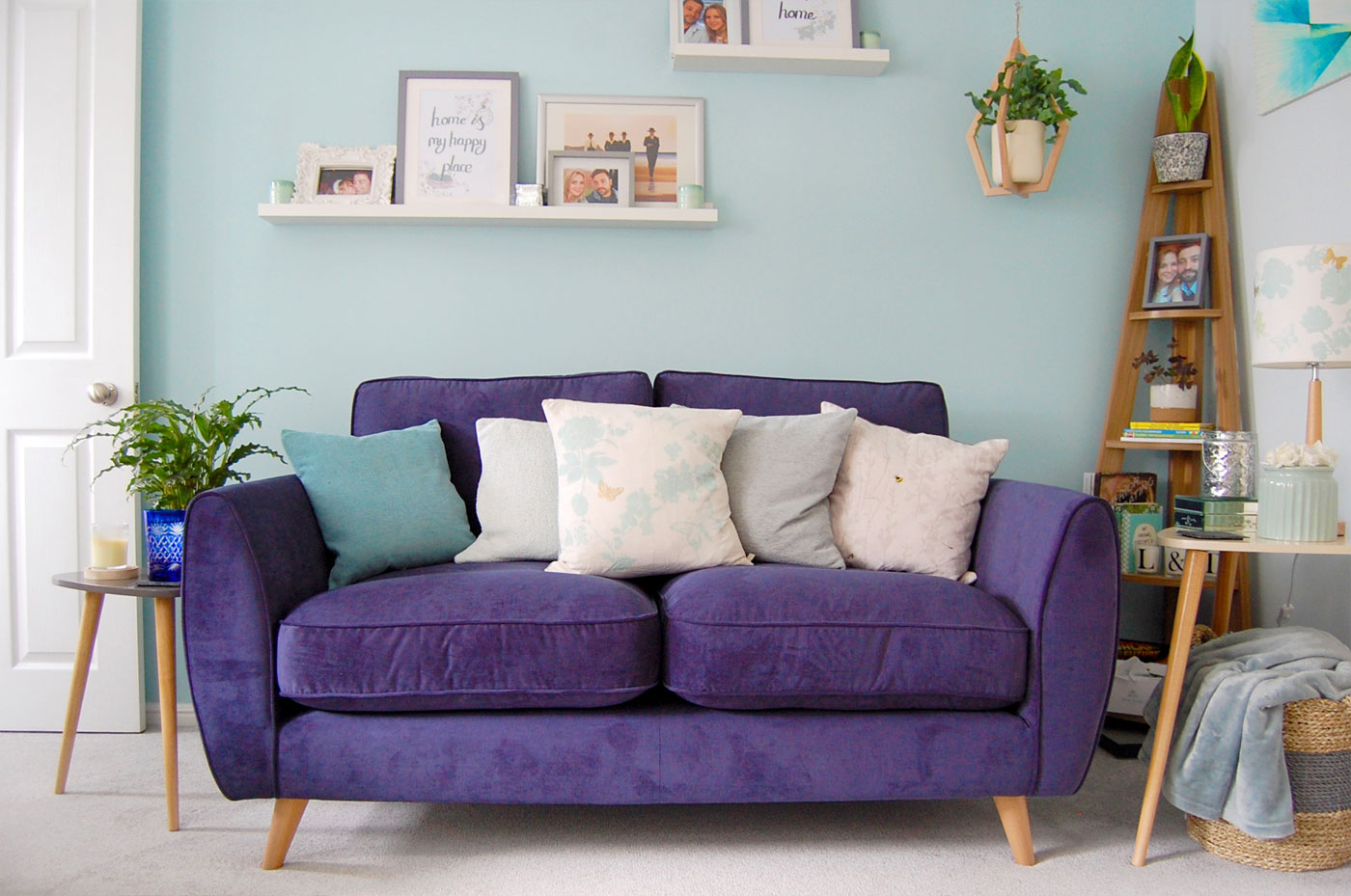
So much so, my interior products have always been aimed towards colour psychology and its benefits towards having particular colours in your home. And in return how they will make you (and those you live with) feel.
This was central when it came to decorating our home, and researching what colours would bring out particular feelings in certain rooms, as well as helping with my Chronic fatigue Syndrome; as having a calming and feel-good atmosphere at home, for me, is hugely important for my health and well-being.
More recently I have bought and been reading ‘The Little Book of Colour’ by Karen Haller.
This book is honestly a mini bible to all things colour, giving us an understanding to how colour can transform our lives and how.
‘When it comes to our homes, there is nothing that has such a powerfully transformative effect as colour. Colour can turn where we live from just a place we go back to at the end of the day into a supportive, comfortable haven that expresses and reflects who we truly are. It communicates feeling, creates a mood, affects our energy, our appetites, our sleep, and has a profound effect on our emotional wellbeing and on the behaviours of everyone we live with.’
– Karen Haller, The Little Book of Colour
How To Use Colour In Your Home
There are simple rules to follow by when it comes to Colour Theory, and understanding them is the first step to helping you decide what colours reflect your personality and therefore for decorating your home with.
The Colour Wheel is something we all have seen before. However, how well do you know it, and then know that it can really help towards picking the right colours for your home?
We have three different stages of colour, aka HUES;
PRIMARY COLOURS; Red, Yellow and Blue
SECONDARY COLOURS; Orange (Red & Yellow), Green (Yellow & Blue) and Purple & (Blue and Red)
TERTIARY COLOURS; which are the rest of the colours/hues on the colour wheel, found next to the PRIMARY AND SECONDARY COLOURS, i.e. Blue- Green.
Moving on you then have your WARM and COOL colours split on the colour wheel.
WARM; Red, Yellow, Orange COOL; Blue, Green, PURPLE (will also cross over this line)
HOW DOES THE COLOUR WHEEL PLAY A ROLE FOR DECORATING?
There are three more elements of the colour wheel that play roles when it comes to helping us decorate with colour;
CONTRASTING – opposite colours of the colour wheel.
YELLOW & PURPLE
RED & GREEN
BLUE & ORANGE
Even though given the title ‘Contrasting’, don’t be misled into thinking they can’t be paired together. These contrasting colour matches can work exceptionally well together as a decorating colour palette choice.
TONAL (Analogous)– these colours sit next to one another on the colour wheel.
i.e. BLUE, BLUE-GREEN (TEAL), GREEN. With the Tonal Palette you can pick two, three or four colours that sit next to each other, this is because these colours are all very similar hues. Using the Tonal Palette as a type of colour combination is less contrasting of course.
EVEN (TRIADIC) – three colour selection that form a triangle formation on the colour wheel.
i.e. BLUE, YELLOW, RED
This option gets its name by sitting even across the colour wheel, in a triangle formation and is normally made up of the colour when colour groups, i.e. PRIMARY, SECONDARY and TERTIARY.
Very much like your Tonal colour palette option, using the Even Palette is about how you combine the use of Lightness (the use of Shades and Tints for each colour) with your colour choices.
For example; using a light blue, a light yellow and a light red (pink), is your even colour palette.
However to add more depth and contrast you can think about adding in more shades of colour; dark blue, mustard yellow, magenta pink, each used in subtle ways of layering through accessories and furnishings.
This simple science of the colour wheel is important in understanding how colours make us feel, and which we use in our home.
I’m a big believer that colour choices come down to our personality and what we are attracted to psychologically.
Did you know; ‘95% of British people are too nervous to go all out with colour in their home’ (The Little Book of Colour, Karen Haller), and a further ‘75% of us decorate not to please ourselves, but to please other people’. (The Little Book of Colour, Karen Haller)
I felt sad when I heard these facts. Because when it came to decorating our home, the colours we choose are what reflects us as people, and portray how we wanted each room in our home to feel.
However, there are certain ‘rules’ you can follow when you want to know how to use colour in your home. In order to create particular atmospheres to help you gain your confidence of involving colour, for yourself, and even those who come to visit.
With this I would love to help you with your decorating and interior styling ideas. Please get in contact if you would like to work together in helping colour flow in your home, to make it an environment that summarises your family and your personality.
(How To Use Colour In Your Home; to be continued…)


Leave A Comment